If you are a graphic designer or a business owner looking to refresh your brand, it’s important to stay updated with the latest graphic design trends in the Philippines. In this blog post, we’ll explore the top 10 graphic design trends that are currently making waves in the Philippine design scene. From minimalist designs to bold typography, we’ve got you covered. By implementing these trends, you can create a visually appealing brand that will stand out from the competition and capture the attention of your target audience. So without further ado, let’s dive into the top 10 graphic design trends in the Philippines.
1. The Clay Look
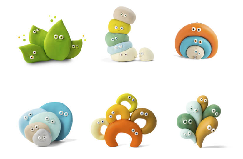
This design style incorporates textures and shapes that mimic the look and feel of clay, giving designs a warm and organic feel. The Clay Look is versatile and can be used in a variety of design projects, from branding to packaging and product design. By incorporating this trend into your designs, you can create a unique and memorable brand identity that stands out from the competition. Additionally, the Clay Look is easily adaptable to different color schemes, making it an excellent choice for designers who want to experiment with color.
2. The 3D Memphis Style
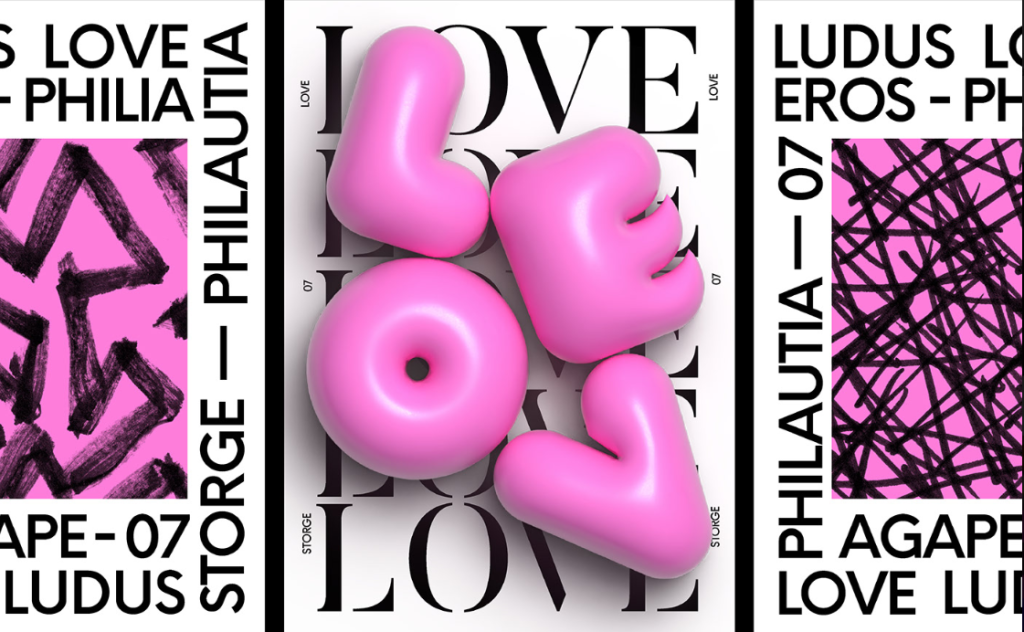
This trend takes inspiration from the iconic Memphis Design movement of the 1980s, which features bold geometric shapes, bright colors, and playful patterns. The 3D aspect adds a modern twist to this retro style by incorporating three-dimensional elements that make designs appear more dynamic and interactive. This trend is particularly popular in the Philippines as it offers a fresh and contemporary take on a classic design style, making it perfect for businesses looking to capture the attention of a younger and more design-savvy audience.
3. The Clean Style
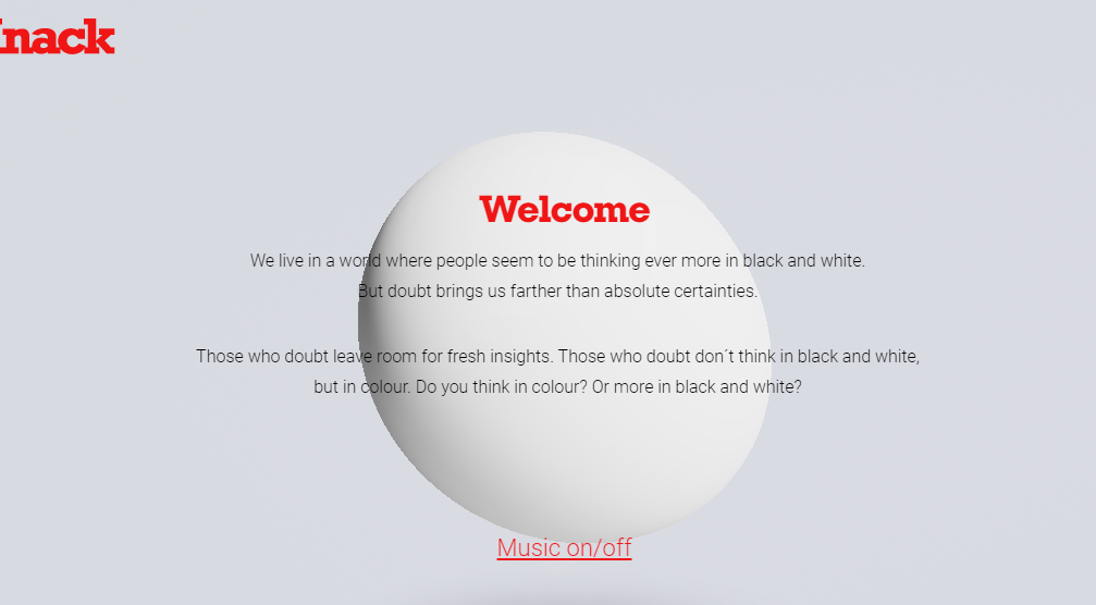
In a world where attention spans are short and clutter is abundant, clean design is a refreshing change. With a focus on negative space, clean lines, and simple shapes, this style is perfect for brands that want to convey a message of sophistication and modernity. Furthermore, it is versatile and can be adapted to different media such as print and digital. As a result, it is a popular choice among Filipino graphic designers who seek to create designs that are both aesthetically pleasing and effective in communicating the intended message.
4. Trippy Design
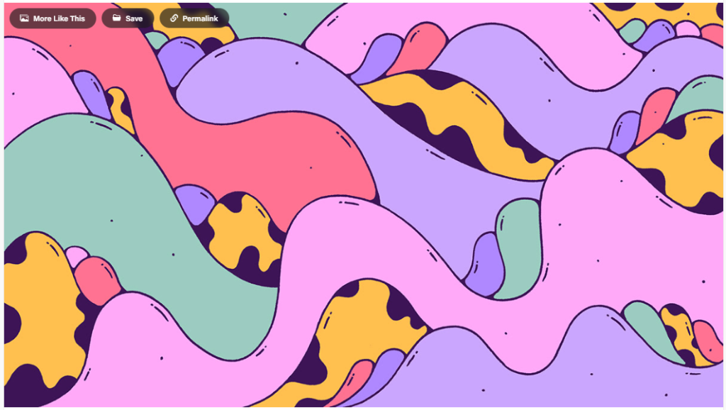
This design style features vibrant, bold colors, distorted shapes, and surreal imagery that creates a surreal experience. Trippy design is gaining popularity in the Philippines as it offers a unique and memorable approach to branding and marketing. By incorporating trippy design into their campaigns, businesses can create a distinct identity that stands out from the crowd and captures the attention of potential customers.
5. Neon & Abstract Cartoon Stickers
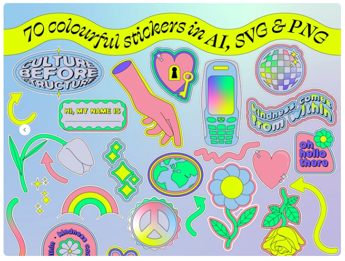
These stickers feature bold, vibrant colors and often incorporate abstract shapes and cartoon-like characters that are both visually appealing and relatable to a younger demographic. The use of neon colors and bold designs also allows these stickers to stand out in a crowded market, making them ideal for businesses looking to capture the attention of their target audience. Additionally, these stickers are versatile and can be used in a variety of mediums, from social media graphics to physical stickers and merchandise.
6. 70s Retro Flat Designs

These designs feature bold and vibrant color palettes, geometric shapes, and a flat, minimalistic style that harkens back to the 1970s. This trend has become increasingly popular in the Philippines due to its versatility and ability to convey a sense of nostalgia and warmth. Whether it’s used in logos, posters, or social media graphics, 70s retro flat designs are a great way to make a bold statement and capture the attention of your target audience. By incorporating this trend into your design work, you can create a visually appealing brand that stands out from the competition and resonates with your customers.
7. Simplified 3D Style
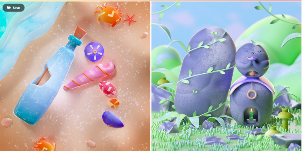
This trend involves the use of simplified 3D shapes, textures, and gradients to create a depth of field that adds visual interest and dimension to designs. With the rise of digital media, this style has become increasingly popular, as it provides a clean and concise aesthetic that is easy to read and understand. Additionally, simplified 3D style works well across a variety of mediums, from website design to branding, making it a versatile choice for businesses and designers alike.
8. Abstract Line Art Characters
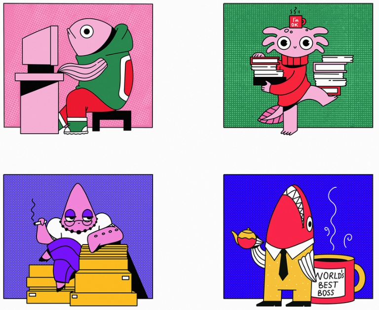
This trend features minimalist designs of characters created using simple lines and geometric shapes, which are then filled with vibrant colors or gradients. This style is perfect for brands looking to communicate their message in a visually appealing and concise way. Additionally, this trend is popular due to its versatility, as it can be used across a wide range of industries and niches.
9. Artistic Serif Fonts
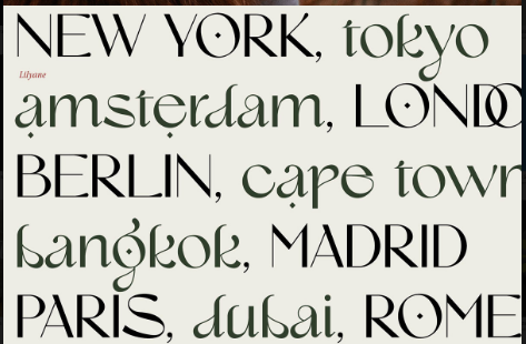
These fonts are characterized by their decorative flourishes and embellishments, which add a touch of elegance and sophistication to any design. They are often used in branding and packaging design, as well as in editorial layouts and invitations. In addition, Artistic Serif Fonts can be used to create a vintage or retro feel, making them a versatile choice for a range of design projects. By incorporating these fonts into your designs, you can add a touch of personality and creativity that will help your brand stand out from the competition.
10. Rainbow Palette Colors
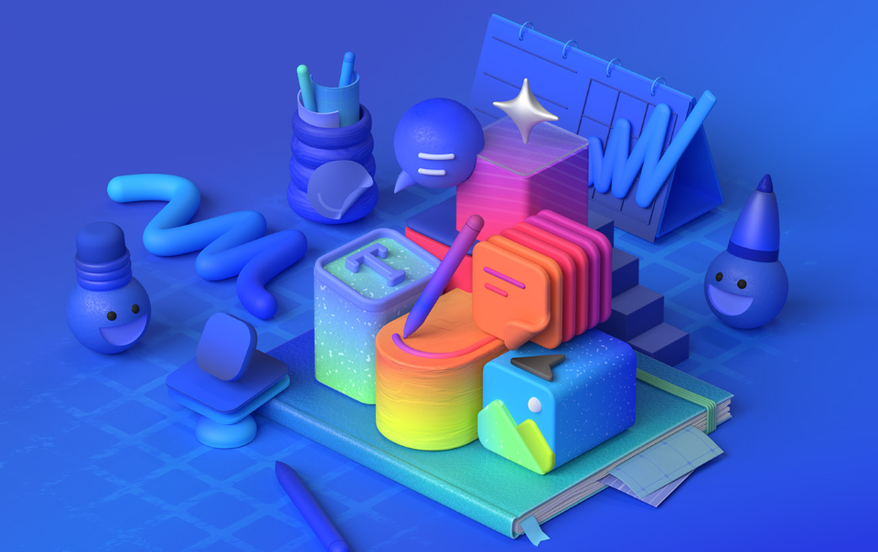
This trend involves using a range of colors in a design, often in a gradient or ombre effect, to create a vibrant and dynamic look. Rainbow palette colors are being used in various design elements, such as logos, illustrations, and backgrounds, to add a playful and fun vibe to a brand’s identity. With the rise of social media, this trend has become increasingly popular as brands are looking for ways to stand out and make a statement.
Conclusion
In conclusion, staying up-to-date with the latest graphic design trends in the Philippines can help elevate your brand and make it more visually appealing to your target audience. From incorporating bold typography to experimenting with vibrant colors and gradients, there are plenty of design trends to choose from. By leveraging these trends, you can create a unique brand identity that stands out from the competition and captures the attention of potential customers. So go ahead and experiment with these top 10 graphic design trends in the Philippines to create a brand that resonates with your target audience and drives business growth. Stay tuned for more blog inspiration~

